


Project type
B2B Website, Semiconductor Industry
Team
1 Web designer, 1 Sales manager, 1 developer, 1 CEO
Role
Web design, Content strategy, Brand communication
Timeline
6 months
Overview
MPP’s website overhaul aimed at reinforcing the company’s digital presence and building trust with global clients through a clear presentation of strengths, products and user cases. My role as a web designer was to improve the page structure, visual identity and create clear content for brand communication.
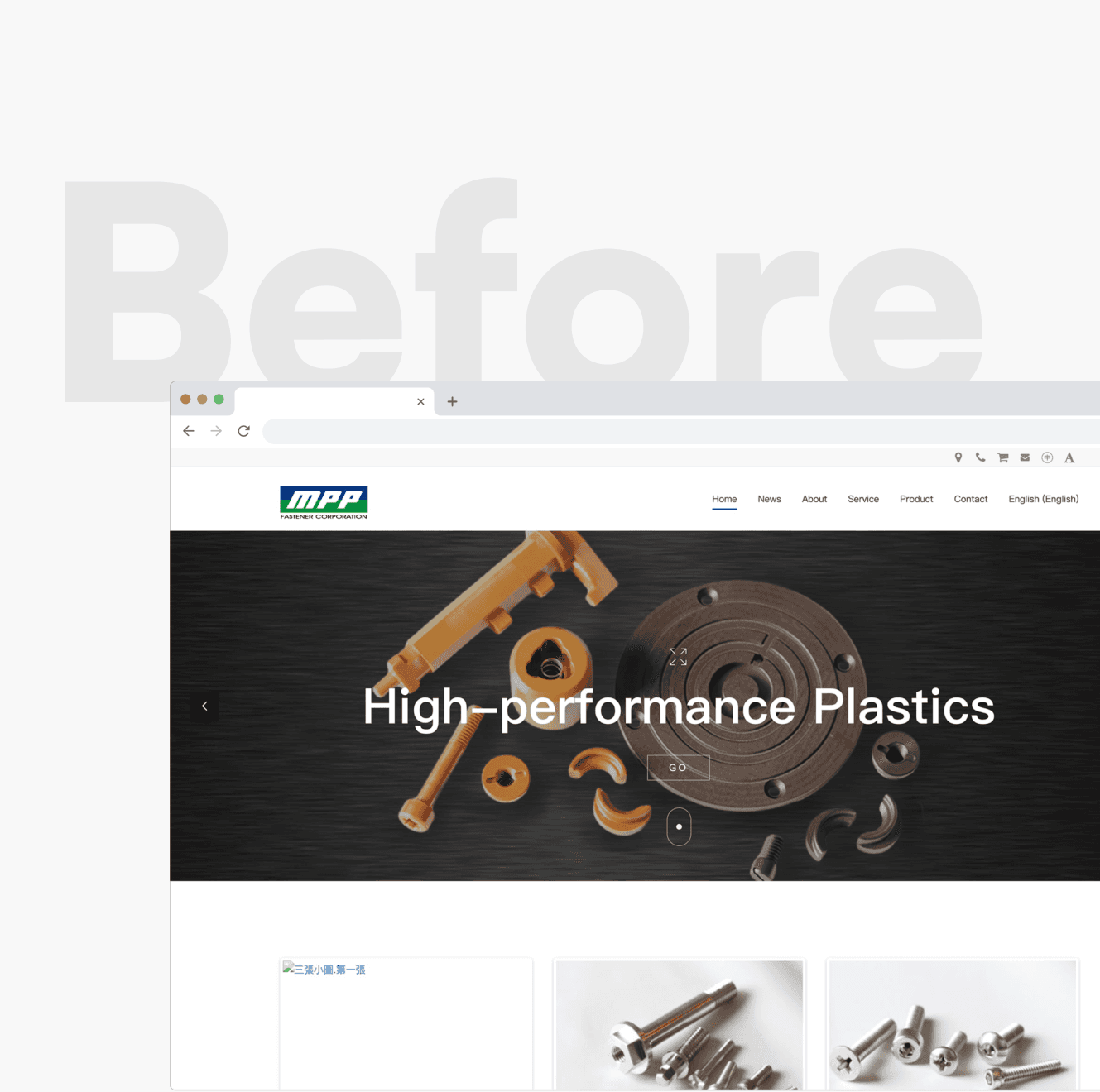

The homepage before (left) and after (right) the redesign!

Key Problems and Insights
As the company expanded its international market, the website became the first point of contact for many potential clients, making the redesign more important. The previous site did not clearly communicate the company’s product value or build enough trust with visitors, which made it difficult for clients to understand what MPP offered.
Through interviews with sales representatives who have direct experience with clients, three key insights were prioritized to address this:

The website needed to build trust quickly

Product and service value had to be communicated more clearly

Potential clients should be able to contact the company without friction
Besides, a competitive analysis was conducted to identify common design patterns in this industry and opportunities to improve the current website:

A homepage more engaging with visitors


Coherent brand colors


Well-organized product / service offers

Design Approach
Content strategy
A brainstorming session helped identify the company’s strengths, product highlights, and service offerings. The goal was to create content that felt professional while remaining easy to understand for a broader audience.

Website structure
The content hierarchy was reorganized through a sitemap to clarify how each section should be arranged. This helped prioritize key information so visitors could find what they needed more quickly.

Conversion touchpoints
To improve conversions, CTAs were added across key pages to encourage further contact. The contact form was also simplified to reduce friction and increase the likelihood of inquiries.

Visual identity
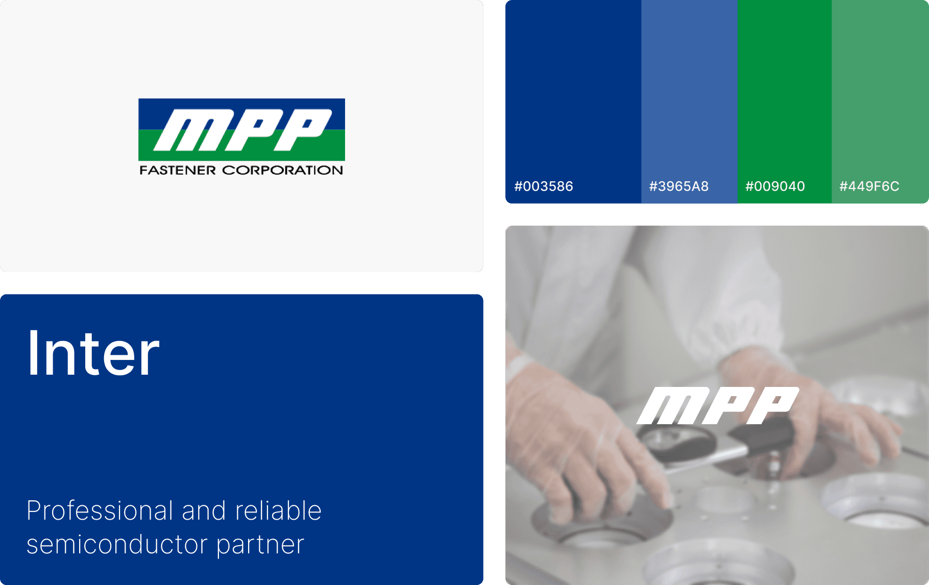
A unified color and icon system was introduced to create a more consistent experience across the website. This also helped reinforce a stronger brand presence throughout the pages.
Impact
The redesign helped MPP present its product value more clearly and create a more consistent brand presence across the website. By simplifying the content flow and improving the visual hierarchy, the site became easier for international clients to understand and for the team to use as a communication tool.

Reflection / Next Steps
This project taught me how to quickly build a stronger understanding of a highly technical industry and translate complex information into clearer, more accessible messaging for B2B buyers.
Future opportunities for the brand could be highlighting its sustainability commitments and creating more human-centered blog content to strengthen brand image and create meaningful touchpoints for clients.


