


Sezaam Back Office Redesign
Project type
Internal tool, Industry
Team
1 Product designer, 1 Product manager, 2 developers, 1 CEO
Role
Product designer
Timeline
2 months
Overview
Sezaam’s Back-Office redesign focused on simplifying complex workflows and creating a clearer interface for internal operations. I worked as a product designer, with a focus on restructuring key flows, organizing dense information, and improving the overall interaction logic, transforming a dense system into a more intuitive product.
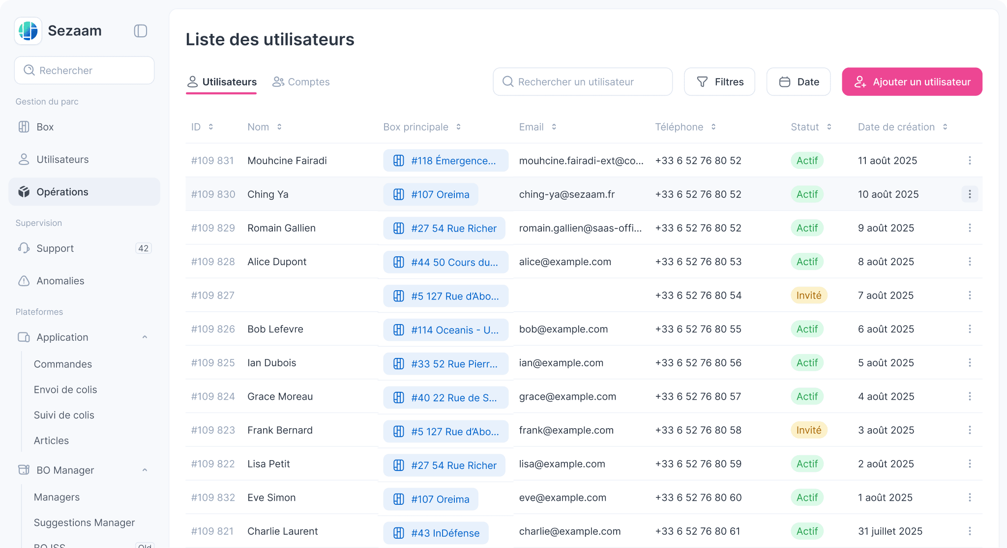

Drag to see the before and after designs!
What do users expect for the new interface?
Before jumping into wireframing, I spent time understanding the needs of different teams:
Customer success team
Faster access to key information
Hardware team
Easier form completion and fewer manual steps
Software team
Better error handling and clearer role management
All teams mentioned one common pain point: handling customer support calls is painful. They wanted to centralize all relevant data in a single view without leaving their current flow.
Problem
The existing structure made daily operations slower and more error-prone, mainly due to two issues:

Fragmented information
Information was spread across multiple screens, forcing users to jump between pages to find or compare data.

Deeply nested interface
Design Approach
To address the core problems, I applied the following design approaches to improve the user flow:
Overall navigation
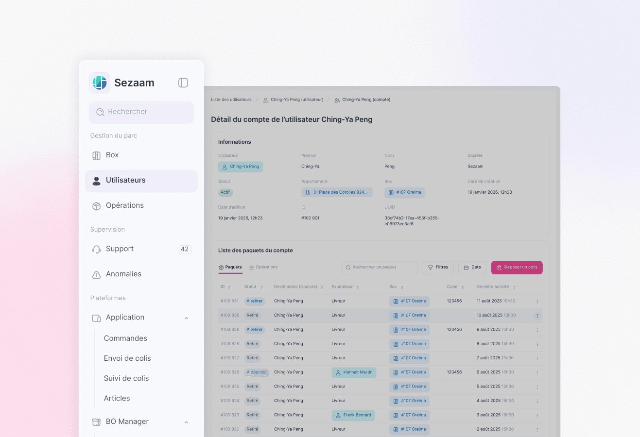
I restructured the interface by grouping related functionalities under the same category, and placed the most frequently used sections at the top of the navigation bar.
Data & information presentation
Related content was grouped more logically using tabs, enabling users to view information without switching pages. To prevent interruption of their current workflow, side panels were used to help users compare different data on the same screen.

Streamlined Editing
Inline edit was introduced to reduce unnecessary steps. Instead of opening a separate edit mode, making changes, and then submitting them, users can directly edit content in place, which streamlines the workflow and saves time.

Use of existing design system to speed up the development
Mingcute design system was used to create components and build pages quickly and consistently. This made the product easier to scale over time and reduced development time.

Impact
This redesign transformed Seizam’s BO into an easy-to-use, time-saving internal tool that helps users access key information faster and compare relevant data without wasting time searching across pages. With a clearer interface and a more considered UX, it improves the efficiency of daily operational tasks and facilitates customer support.


